
UI Component Library

The Admin UI is built on a customized version of the Clarity Design System. This means that if you are writing Angular-based UI extensions, you can use the same components that are used in the rest of the Admin UI. If you are using React, we are gradually exporting the most-used components for use with React.

Buttons

Buttons

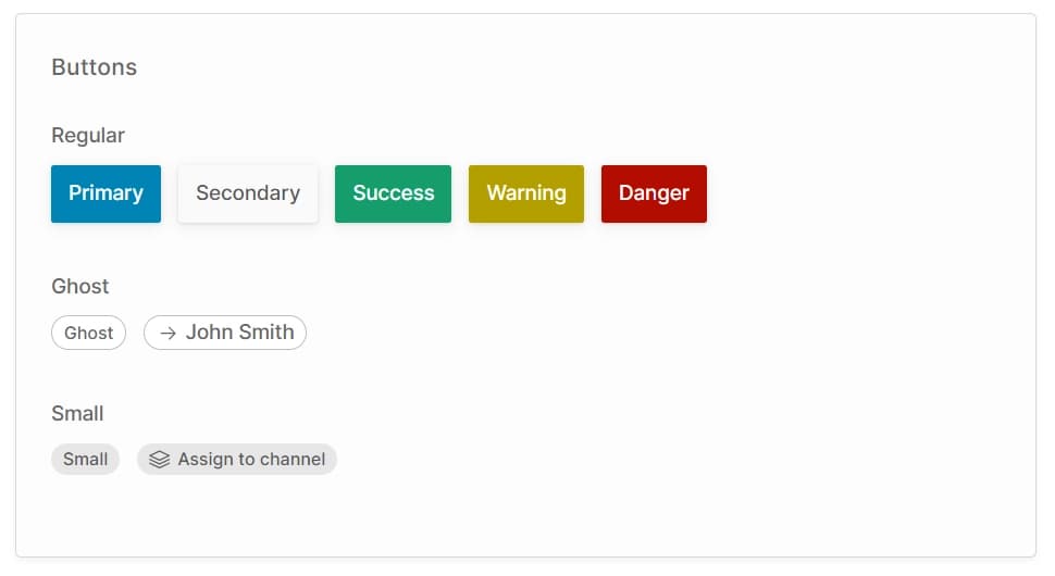
There are three types of button:

  • Regular: These are general-purpose buttons available in a number of styles. They are used in the action bar and as confirmation buttons for dialogs.
  • Ghost: This style is primarily used to indicate a column in a table which is a link to a detail view.
  • Small: This style is used for secondary actions of less prominence than a standard button, or when the button must fit in a small space.
Html
<button class="button primary">Primary</button><button class="button secondary">Secondary</button><button class="button success">Success</button><button class="button warning">Warning</button><button class="button danger">Danger</button><button class="button-ghost">Ghost</button><a class="button-ghost" [routerLink]="['/extensions/my-plugin/my-custom-route']">    <clr-icon shape="arrow" dir="right"></clr-icon>    John Smith</a><button class="button-small">Small</button><button class="button-small">    <clr-icon shape="layers"></clr-icon>    Assign to channel</button>

Icons

You can use the built-in Clarity Icons for a consistent look-and-feel with the rest of the Admin UI app.

Icons
Html
<clr-icon shape="star" size="8"></clr-icon><clr-icon shape="star" size="16"></clr-icon><clr-icon shape="star" size="24"></clr-icon><clr-icon shape="star" size="36"></clr-icon><clr-icon shape="star" size="48"></clr-icon><clr-icon shape="star" size="56"></clr-icon><clr-icon shape="user" class="has-badge--success"></clr-icon><clr-icon shape="user" class="has-alert"></clr-icon><clr-icon shape="user" class="has-badge--info"></clr-icon><clr-icon shape="user" class="has-badge--error"></clr-icon><clr-icon shape="user" class="is-success"></clr-icon><clr-icon shape="user" class="is-info"></clr-icon><clr-icon shape="user" class="is-warning"></clr-icon><clr-icon shape="user" class="is-error"></clr-icon>

Form inputs

Form inputs are styled globally, so you don't need to use special components for these. The label & tooltip styling is controlled by the "form field" wrapper component.

Form input
Html
<div class="form-grid">    <vdr-form-field label="Page title">        <input type="text" />    </vdr-form-field>    <vdr-form-field label="Select input">        <select>            <option>Option 1</option>            <option>Option 2</option>        </select>    </vdr-form-field>    <vdr-form-field label="Checkbox input">        <input type="checkbox" />    </vdr-form-field>    <vdr-form-field label="Textarea input">        <textarea></textarea>    </vdr-form-field>    <vdr-form-field label="With tooltip" tooltip="This is a tooltip for the form input">        <input type="text" />    </vdr-form-field>    <vdr-form-field label="Invalid with error">        <input type="text" [formControl]="invalidFormControl" />    </vdr-form-field>    <vdr-rich-text-editor        class="form-grid-span"        label="Description"    ></vdr-rich-text-editor></div>

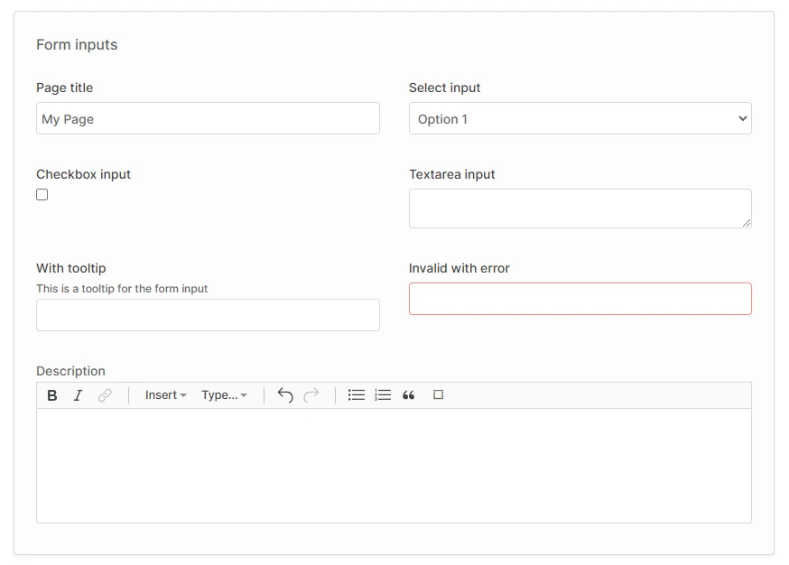
The form-grid class is used to lay out the form fields into a 2-column grid on larger screens, and a single column on smaller screens. If you want to force a particular field to always take up the full width (i.e. to span 2 columns at all screen sizes), you can add the form-grid-span class to that form field.
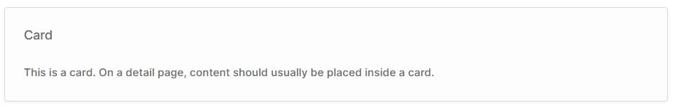
Html
<div class="form-grid">    <vdr-form-field label="Page title" class="form-grid-span"> <!-- [!code highlight] -->        <input type="text" />    </vdr-form-field></div>

Cards

Cards are used as a general-purpose container for page content, as a way to visually group related sets of components.
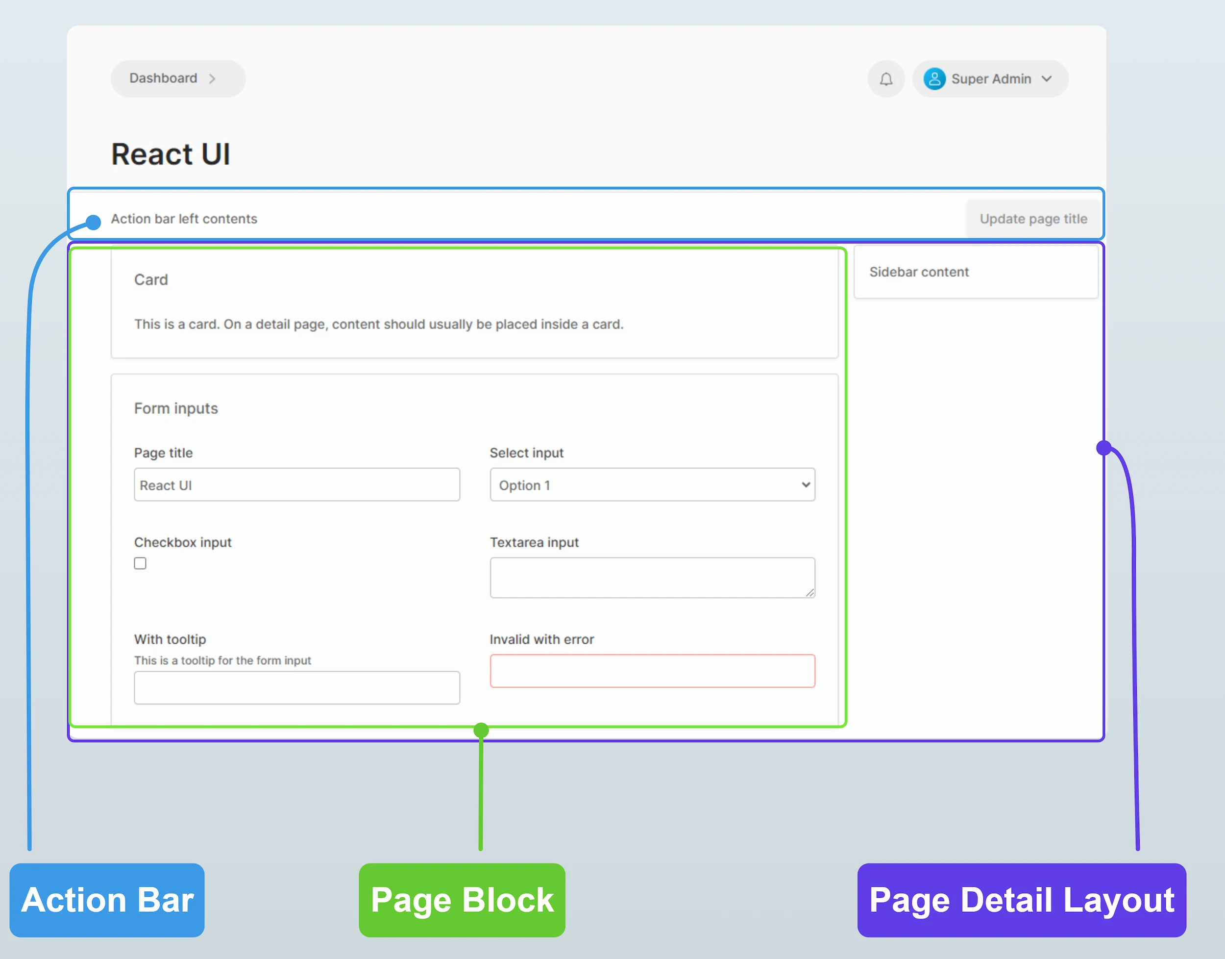
Card
Html
<vdr-card title="Card">    This is a card. On a detail page, content should usually be placed inside a card.</vdr-card>

Layout

The following layout components are available:

  • Page block: This is a wrapper which applies consistent margins and max-width to the contents of the page. In general, the contents of a page should always be wrapped in this component except when using the DataTable2 component, which has its own styling for margins and width.
  • Action bar: This is a wrapper for the top area of the page, just below the header section. This is where the primary action buttons for the page should be located.
  • Page detail layout: For detail views, this wrapper provides a two-column layout with a main content area and a sidebar.
Layout
Html
<vdr-page-block>    <vdr-action-bar>        <vdr-ab-left>Action bar left contents</vdr-ab-left>        <vdr-ab-right>            <button class="button primary">Primary action</button>        </vdr-ab-right>    </vdr-action-bar></vdr-page-block><vdr-page-detail-layout>    <vdr-page-detail-sidebar>        <vdr-card>Sidebar content</vdr-card>    </vdr-page-detail-sidebar>    <vdr-page-block>        <vdr-card title="Card">            This is a card. On a detail page, content should usually be placed inside a card.        </vdr-card>    </vdr-page-block></vdr-page-detail-layout>
Was this chapter helpful?
Report Issue
Edited Feb 3, 2026·Edit this page