Input Component Examples
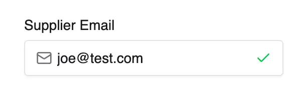
Email Input with Validation
This example uses the react-hook-form validation state in order to display an icon indicating
the validity of the email address, as defined by the custom field "pattern" option:
src/plugins/my-plugin/dashboard/components/email-input.tsx
import {AffixedInput, DashboardFormComponent, useFormContext} from '@vendure/dashboard';import {Mail, Check, X} from 'lucide-react';export const EmailInputComponent: DashboardFormComponent = ({name, value, onChange, disabled}) => { const {getFieldState} = useFormContext(); // [!code highlight] const isValid = getFieldState(name).invalid === false; // [!code highlight] return ( <AffixedInput prefix={<Mail className="h-4 w-4 text-muted-foreground" />} suffix={ value && (isValid ? ( // [!code highlight] <Check className="h-4 w-4 text-green-500" /> // [!code highlight] ) : ( // [!code highlight] <X className="h-4 w-4 text-red-500" /> // [!code highlight] )) // [!code highlight] } value={value || ''} onChange={e => onChange(e.target.value)} disabled={disabled} placeholder="Enter email address" className="pl-10 pr-10" name={name} /> );};Multi-Currency Price Input
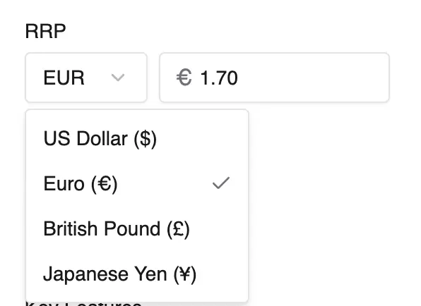
This example demonstrates a component with its own state (using useState) and more complex
internal logic.
src/plugins/my-plugin/dashboard/components/price-input.tsx
import { AffixedInput, DashboardFormComponent, Select, SelectContent, SelectItem, SelectTrigger, SelectValue, useLocalFormat,} from '@vendure/dashboard';import { useState } from 'react';export const MultiCurrencyInputComponent: DashboardFormComponent = ({ value, onChange, disabled, name }) => { const [currency, setCurrency] = useState('USD'); const { formatCurrencyName } = useLocalFormat(); const currencies = [ { code: 'USD', symbol: '$', rate: 1 }, { code: 'EUR', symbol: '€', rate: 0.85 }, { code: 'GBP', symbol: '£', rate: 0.73 }, { code: 'JPY', symbol: '¥', rate: 110 }, ]; const selectedCurrency = currencies.find(c => c.code === currency) || currencies[0]; // Convert price based on exchange rate const displayValue = value ? (value * selectedCurrency.rate).toFixed(2) : ''; const handleChange = (val: string) => { const numericValue = parseFloat(val) || 0; // Convert back to base currency (USD) for storage const baseValue = numericValue / selectedCurrency.rate; onChange(baseValue); }; return ( <div className="flex space-x-2"> <Select value={currency} onValueChange={setCurrency} disabled={disabled}> <SelectTrigger className="w-24"> <SelectValue> <div className="flex items-center gap-1">{currency}</div> </SelectValue> </SelectTrigger> <SelectContent> {currencies.map(curr => { return ( <SelectItem key={curr.code} value={curr.code}> <div className="flex items-center gap-2">{formatCurrencyName(curr.code)}</div> </SelectItem> ); })} </SelectContent> </Select> <AffixedInput prefix={selectedCurrency.symbol} value={displayValue} onChange={e => onChange(e.target.value)} disabled={disabled} placeholder="0.00" name={name} /> </div> );};Tags Input Component
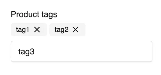
This component brings better UX to a simple comma-separated tags custom field.
src/plugins/my-plugin/dashboard/components/tags-input.tsx
import { Input, Badge, Button, DashboardFormComponent } from '@vendure/dashboard';import { useState, KeyboardEvent } from 'react';import { X } from 'lucide-react';export const TagsInputComponent: DashboardFormComponent = ({ value, onChange, disabled, name, onBlur }) => { const [inputValue, setInputValue] = useState(''); // Parse tags from string value (comma-separated) const tags: string[] = value ? value.split(',').filter(Boolean) : []; const addTag = (tag: string) => { const trimmedTag = tag.trim(); if (trimmedTag && !tags.includes(trimmedTag)) { const newTags = [...tags, trimmedTag]; onChange(newTags.join(',')); } setInputValue(''); }; const removeTag = (tagToRemove: string) => { const newTags = tags.filter(tag => tag !== tagToRemove); onChange(newTags.join(',')); }; const handleKeyDown = (e: KeyboardEvent<HTMLInputElement>) => { if (e.key === 'Enter' || e.key === ',') { e.preventDefault(); addTag(inputValue); } else if (e.key === 'Backspace' && inputValue === '' && tags.length > 0) { removeTag(tags[tags.length - 1]); } }; return ( <div className="space-y-2"> {/* Tags Display */} <div className="flex flex-wrap gap-1"> {tags.map((tag, index) => ( <Badge key={index} variant="secondary" className="gap-1"> {tag} <Button type="button" variant="ghost" size="icon" className="h-4 w-4 p-0 hover:bg-transparent" onClick={() => removeTag(tag)} disabled={disabled} > <X className="h-3 w-3" /> </Button> </Badge> ))} </div> {/* Input */} <Input value={inputValue} onChange={e => setInputValue(e.target.value)} onKeyDown={handleKeyDown} onBlur={onBlur} disabled={disabled} placeholder="Type a tag and press Enter or comma" name={name} /> </div> );};Auto-generating Slug Input
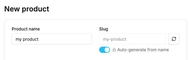
This example demonstrates a component that automatically generates a slug from the product name.
It uses the react-hook-form watch method to get the value of another field in the form and
react to changes in that field.
src/plugins/my-plugin/dashboard/components/slug-input.tsx
import { Input, Button, Switch, DashboardFormComponent, useFormContext } from '@vendure/dashboard'; import { useState, useEffect } from 'react'; import { RefreshCw, Lock, Unlock } from 'lucide-react'; export const SlugInputComponent: DashboardFormComponent = ({ value, onChange, disabled, name }) => { const [autoGenerate, setAutoGenerate] = useState(!value); const [isGenerating, setIsGenerating] = useState(false); const { watch } = useFormContext(); const nameValue = watch('translations.0.name'); const generateSlug = (text: string) => { return text .toLowerCase() .replace(/[^a-z0-9 -]/g, '') // Remove special characters .replace(/\s+/g, '-') // Replace spaces with hyphens .replace(/-+/g, '-') // Replace multiple hyphens with single .trim('-'); // Remove leading/trailing hyphens }; useEffect(() => { if (autoGenerate && nameValue) { const newSlug = generateSlug(nameValue); if (newSlug !== value) { onChange(newSlug); } } }, [nameValue, autoGenerate, onChange, value]); const handleManualGenerate = async () => { if (!nameValue) return; setIsGenerating(true); // Simulate API call for slug validation/generation await new Promise(resolve => setTimeout(resolve, 500)); const newSlug = generateSlug(nameValue); onChange(newSlug); setIsGenerating(false); }; return ( <div className="space-y-2"> <div className="flex items-center space-x-2"> <Input value={value || ''} onChange={e => onChange(e.target.value)} disabled={disabled || autoGenerate} placeholder="product-slug" className="flex-1" name={name} /> <Button type="button" variant="outline" size="icon" disabled={disabled || !nameValue || isGenerating} onClick={handleManualGenerate} > <RefreshCw className={`h-4 w-4 ${isGenerating ? 'animate-spin' : ''}`} /> </Button> </div> <div className="flex items-center space-x-2"> <Switch checked={autoGenerate} onCheckedChange={setAutoGenerate} disabled={disabled} /> <div className="flex items-center space-x-1 text-sm text-muted-foreground"> {autoGenerate ? <Lock className="h-3 w-3" /> : <Unlock className="h-3 w-3" />} <span>Auto-generate from name</span> </div> </div> </div> ); };Note
Input components completely replace the default input for the targeted field. Make sure your component handles all the data types and scenarios that the original input would have handled.
Related Guides
- Customizing Forms Overview - Learn how to choose between custom field components and native detail-page input overrides
Was this chapter helpful?