Creating Tabbed Pages
Setup
Info
This guide assumes you have a basic understanding of creating custom pages in the Vendure Dashboard, as covered in the Creating List Pages and Creating Detail Pages guides.
Tabbed pages allow you to organize related content into separate tabs within a single page. This is useful for grouping configuration settings, related data views, or different aspects of an entity.
While using them within page blocks is supported, by simply using the Tabs component directly, you may want to use Tabs on the top level of your page.
This is where this guide comes in.
Tabbed Page Example
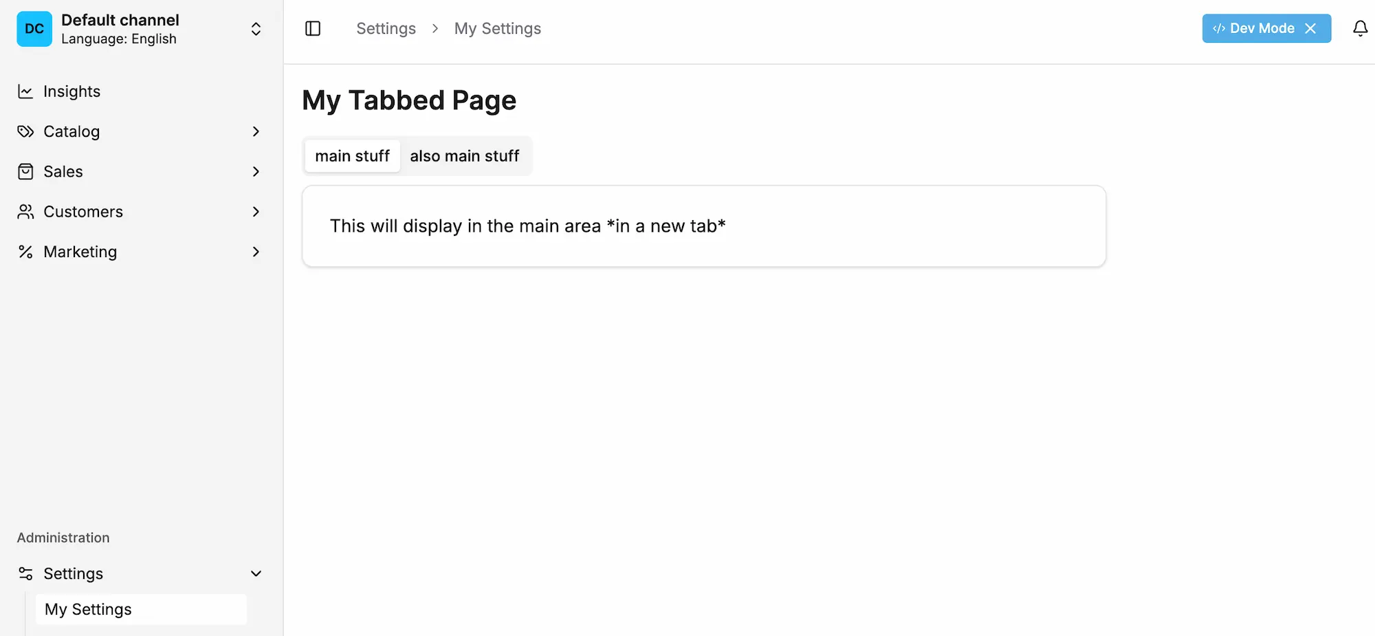
The Dashboard provides tab components that work seamlessly with the Page component to create tabbed interfaces.
Using the correct format is important to avoid style issues and ensure consistent behavior.
When a component grows, you may want to consider using the Tabs component to help you organize your content.
Tab Component
This uses the stock shadcn tab component, docs are avilable here.
Note
Always use the Page component as the root and PageLayout as the only child of the TabContent when creating tabbed pages. This ensures proper styling
and integration with the Dashboard layout system.
Avoiding Nested Layouts
The purpose of this structure is to avoid nested layout components, which can cause style and layout issues.
Warning
One might be tempted to wrap tab content in a FullWidthPageBlock or PageLayout and then place other PageBlock components inside it. This will cause layout problems.
Instead, place PageBlock components directly inside each TabsContent, just as you would in a regular detail page.
Incorrect approach:
Using Tabs with Components
You can use any Dashboard components within tab content, including forms, lists, or custom components:
Was this chapter helpful?