The Action Bar is the bar at the top of the page where you can add buttons and other actions.
All available options are documented in the DashboardActionBarItem reference
Here's a simple example of adding a button to the action bar:
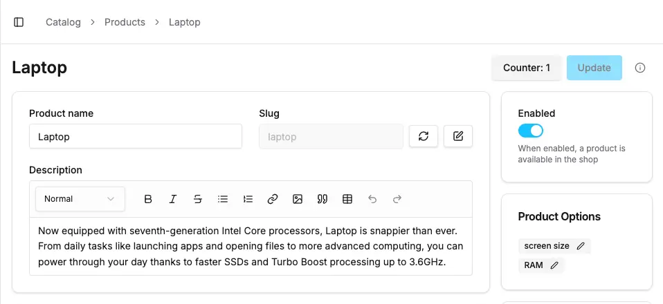
The pageId property is required in order to specify on which page the action bar item should appear.
By default, the item will be placed to the left of any existing action bar items.
However, since Vendure v3.6.0, you can also specify the position property for more control over the placement of your action bar item.
See the section on finding page and item ids below for help in determining the correct pageId and itemId values.
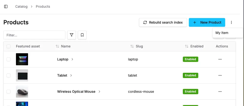
The context prop provides access to:
entity: The current entity being viewed/edited (e.g., Product, Customer, etc.)form: The React Hook Form instance for the current page (if applicable)route: Route information and parametersYou can also define dropdown menu items for the Action Bar. This is useful for secondary actions that are needed less often by administrators.
Make sure to always wrap these in the DropdownMenuItem component for consistent styling.
You can conditionally show action bar items based on the entity or user permissions:
You can add multiple action bar items to the same page:
The dashboard provides several button variants you can use:
default - Primary button stylesecondary - Secondary button styleoutline - Outlined button styleghost - Minimal button styledestructive - For destructive actions (delete, etc.)PermissionGuard for actions that require specific permissionsTo find the pageId and itemId for your action bar items:
The Extension Targets reference lists the most common built-in page IDs, block IDs, action bar item IDs, and toolbar item IDs.
Architecture reviews, custom plugin work, migrations, ongoing support. Get a hand from the team that builds Vendure.
Talk to the team