The Vendure dashboard uses a modern theming system based on CSS custom properties and Tailwind CSS . This guide shows you how to customize the colors and styles by modifying the theme variables in the Vite plugin.
The dashboard also uses the same theming methodology as shadcn/ui
It also uses the shadcn theme provider implementation for Vite
The Vendure dashboard provides a simple way to access theme variables in your components. Here's how to use them:
The easiest way to use theme colors is through Tailwind variable CSS classes:
You can customize the dashboard theme colors by modifying the theme configuration in your vite.config.mts file. Here's an example showing how to change the primary brand colors:
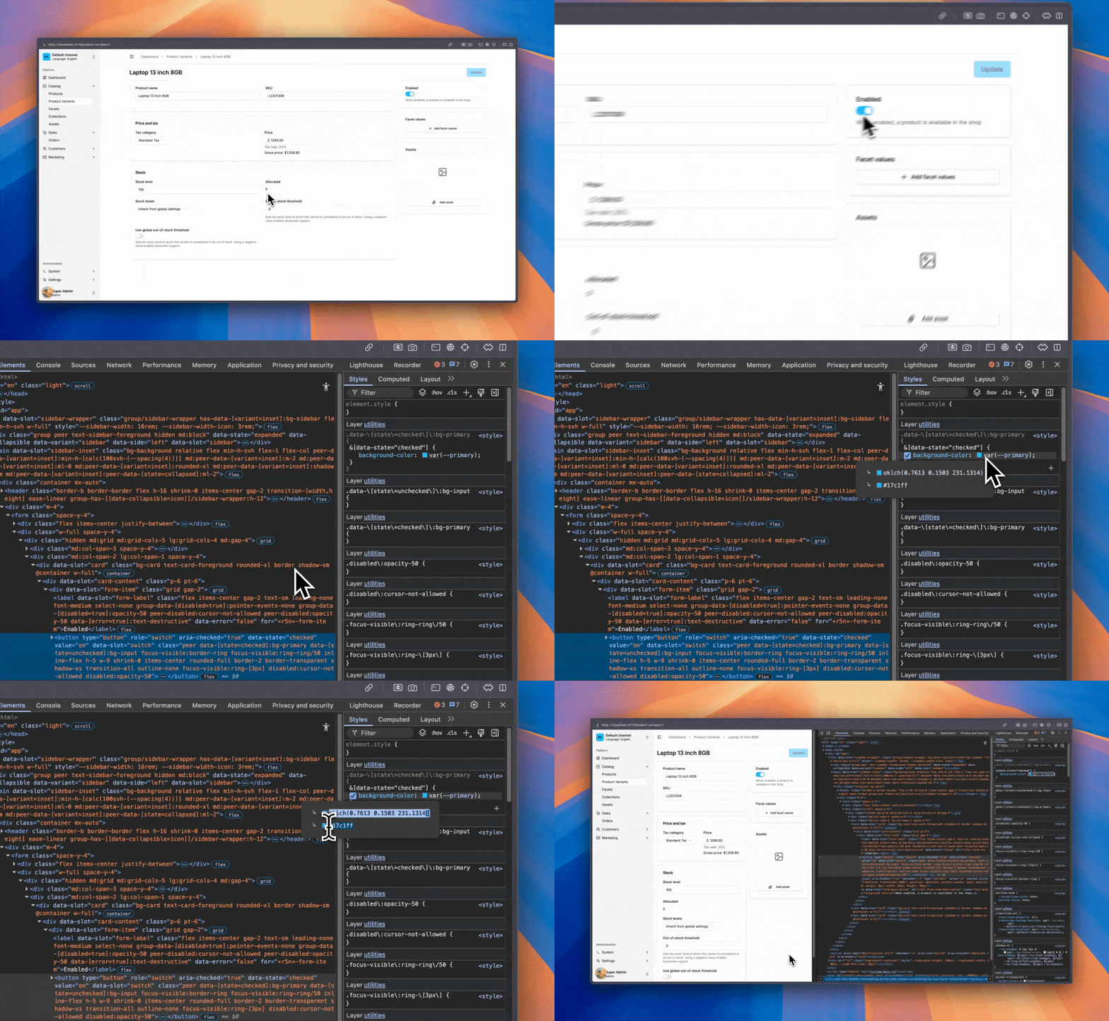
To identify the exact color values used by dashboard elements, you can use your browser's developer tools:
The dashboard defines comprehensive theme variables that are automatically available as Tailwind classes:
| Variable | Description |
|---|---|
--background | Main background |
--foreground | Main text color |
--card | Card background |
--card-foreground | Card text |
--popover | Popover background |
--popover-foreground | Popover text |
| Variable | Description |
|---|---|
--primary | Primary brand color |
--primary-foreground | Text on primary |
--secondary | Secondary actions |
--secondary-foreground | Text on secondary |
--accent | Accent elements |
--accent-foreground | Text on accent |
| Variable | Description |
|---|---|
--destructive | Error/danger actions |
--destructive-foreground | Text on destructive |
--success | Success states |
--success-foreground | Text on success |
--muted | Muted elements |
--muted-foreground | Muted text |
| Variable | Description |
|---|---|
--border | Border color |
--input | Input background |
--ring | Focus ring color |
| Variable | Description |
|---|---|
--chart-1 | Chart color 1 |
--chart-2 | Chart color 2 |
--chart-3 | Chart color 3 |
--chart-4 | Chart color 4 |
--chart-5 | Chart color 5 |
| Variable | Description |
|---|---|
--sidebar | Sidebar background |
--sidebar-foreground | Sidebar text |
--sidebar-primary | Sidebar primary |
--sidebar-primary-foreground | Text on sidebar primary |
--sidebar-accent | Sidebar accent |
--sidebar-accent-foreground | Text on sidebar accent |
--sidebar-border | Sidebar border |
--sidebar-ring | Sidebar focus ring |
| Variable | Description |
|---|---|
--brand | Primary brand color |
--brand-lighter | Lighter brand variant |
--brand-darker | Darker brand variant |
| Variable | Description |
|---|---|
dev-mode | Dev-mode ring |
dev-mode-foreground | Dev-mode foreground |
| Variable | Description |
|---|---|
--font-sans | Sans-serif font |
--font-mono | Monospace font |
| Variable | Description |
|---|---|
--radius | Base border radius |
Architecture reviews, custom plugin work, migrations, ongoing support. Get a hand from the team that builds Vendure.
Talk to the team