UI Component Library
The Admin UI is built on a customized version of the Clarity Design System. This means that if you are writing Angular-based UI extensions, you can use the same components that are used in the rest of the Admin UI. If you are using React, we are gradually exporting the most-used components for use with React.
Buttons
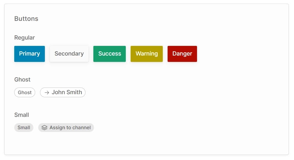
There are three types of button:
- Regular: These are general-purpose buttons available in a number of styles. They are used in the action bar and as confirmation buttons for dialogs.
- Ghost: This style is primarily used to indicate a column in a table which is a link to a detail view.
- Small: This style is used for secondary actions of less prominence than a standard button, or when the button must fit in a small space.
Icons
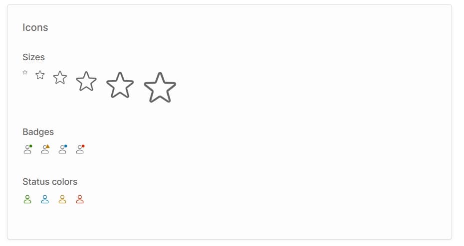
You can use the built-in Clarity Icons for a consistent look-and-feel with the rest of the Admin UI app.